PaRental
Parental is an app that provides parents with convenience by connecting parents and sharing a calendar of their kids' plan, which enables parents easier to find out peers to have a playdate and build up a circle of trust.
Methods
Usability Testing
Heuristic Evaluation
In-depth interview
Role
UX Researcher
Time
July - September. 2019
Type
Internship
Background
Parental was in the initial testing stage testing the MVP (Minimal Viable Product). My goal was to conduct initial user testing and validate the MVP of the product and provide redesign ideas.
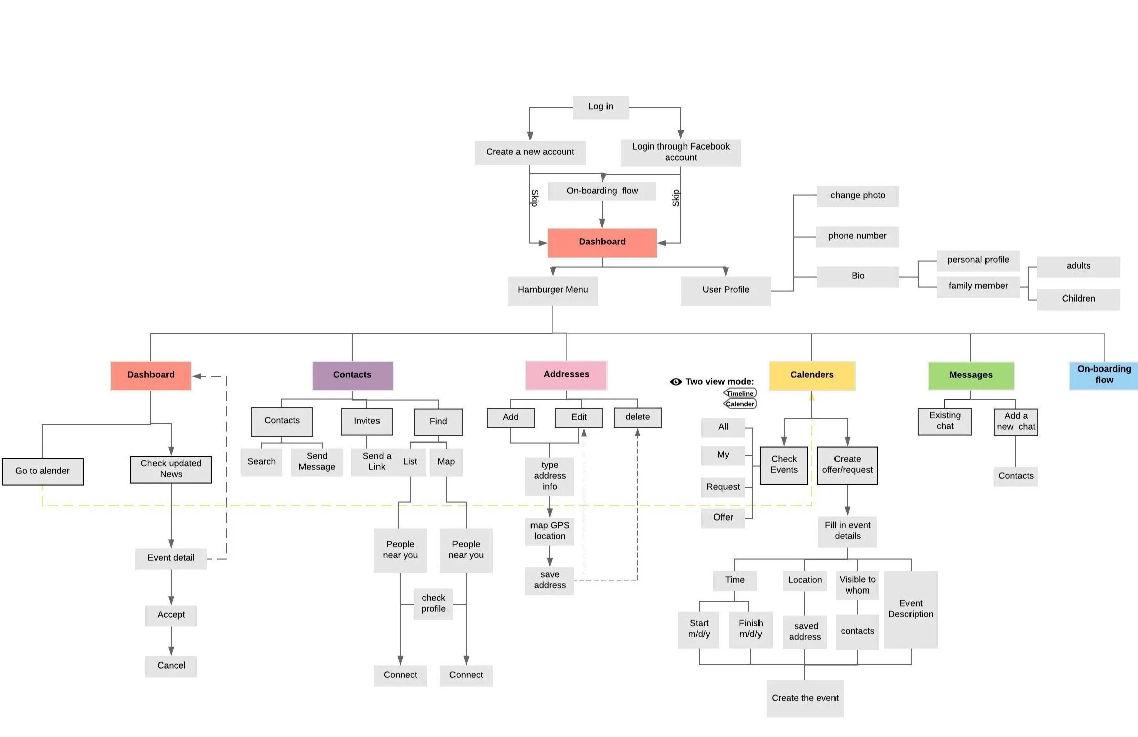
To begin with, I first walked through the product’s IA to get a better understanding of the user flow of current product, and understand the main functions in the application.
Information Architecture
Through paRental you can
Coordinate and organize play dates. (Request/offer)
See what your kid’s friend are up to, and when they’re available to play. (Contacts, Calendar)
Save babysitting costs by pooling resources.
Get awards for organizing activities.
Replace screen time with social and outdoor activities.
Connect with the parents of your kid’s best friends. (Message, communication platform)
Main features to be tested
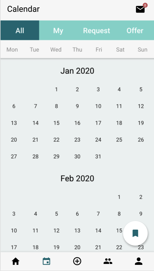
The ability to post your own and your friends needs and availabilities (purpose-built calendar)
The ability to get to participate in these with a click of a button
The ability to know instantly, how much credits you will spend/earn
The ability to see where your kids are at (address function)
The ability to message the other parents
The ability to pay with the credits without feeling bad about it
Usability Testing
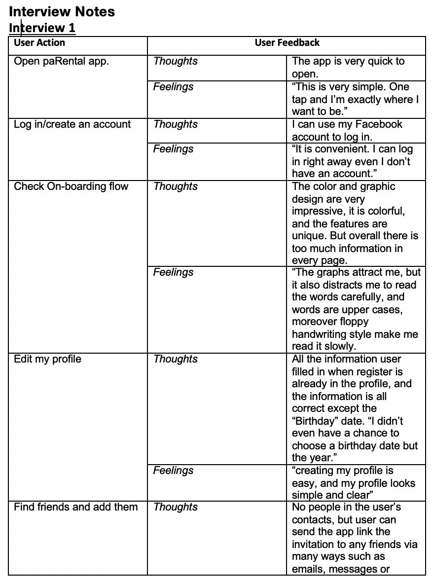
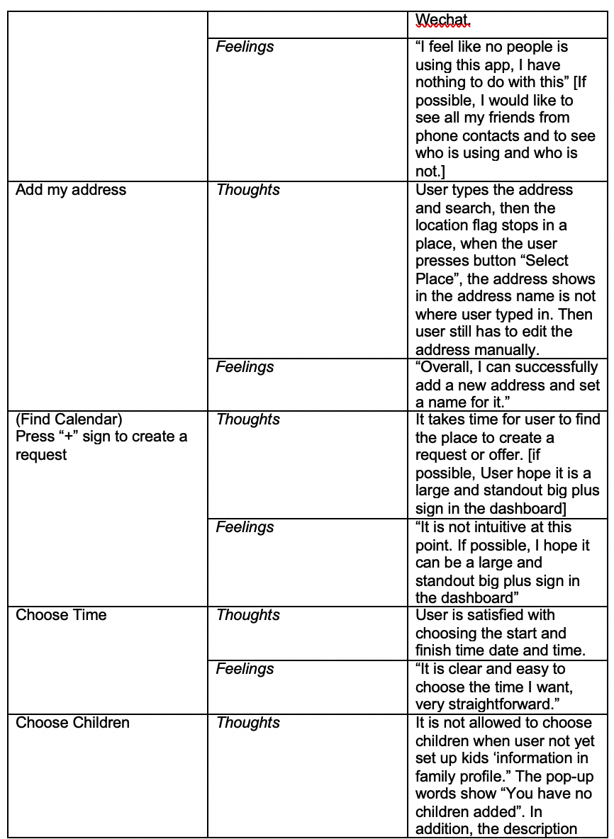
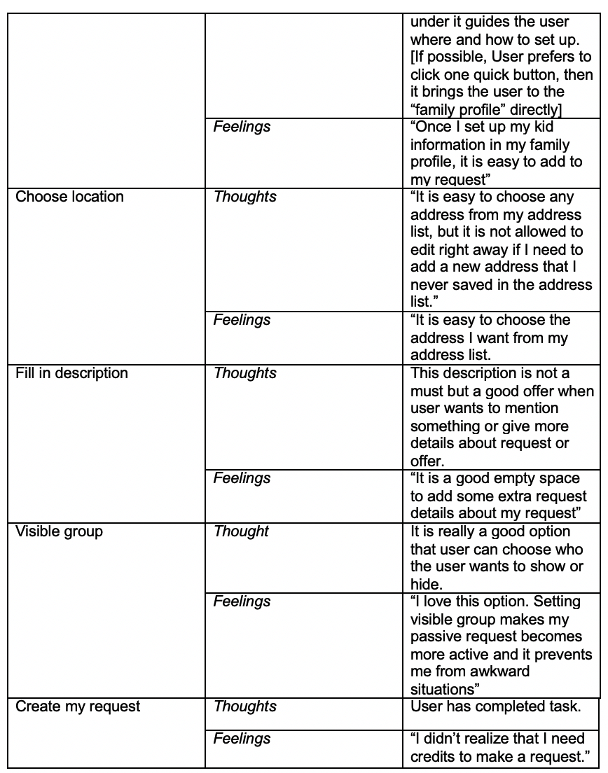
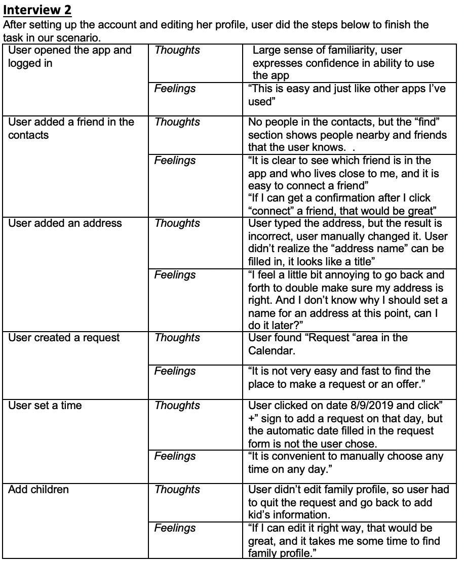
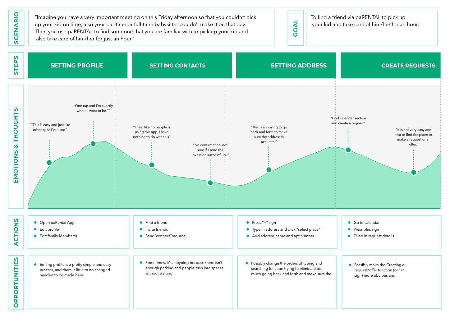
To validate the product’s MVP and get a better understanding of the problem, I conducted an initial user testing. I interviewed four moms and one dad in person. During the interview, I observed their behaviors and recorded their thoughts and feeling in detail for the later analysis and also reported to the founder. Instead of using a persona, I use journey map to let founder and developers understand the problems and what could be done better.
Sample Conversation/Interview notes
User Journey Map
Heuristic Evaluation of Usability
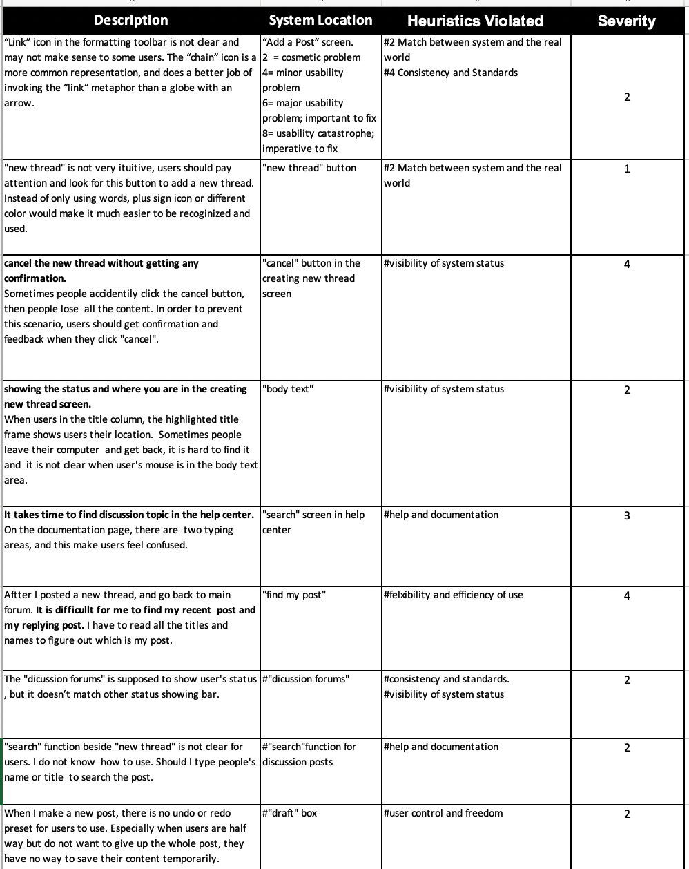
At the same time, I also used Nielsen’s Heuristic Evaluation to further evaluate recent user interfaces. Heuristic evaluation is a process where experts use rules of thumb to measure the usability of user interfaces in independent walkthroughs and report issues. And this will help design teams enhance product usability from early in development. I used a spreed sheet to record the issues and violated principles and also marked level of severity to help my manager and developers understand the potential problems.
Assessing severity range from 1 to 4, 1 represents cosmetic problem and it means no real usability problem, 2 means minor usability problem and 3 means major usability problem and important to fix, and so forth.
After prioritizing the major problems, I ranked them into 5 issues and reported back to development team.
1. Flexibility and Efficiency
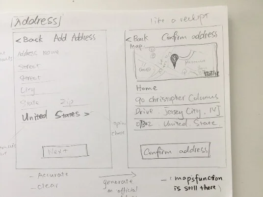
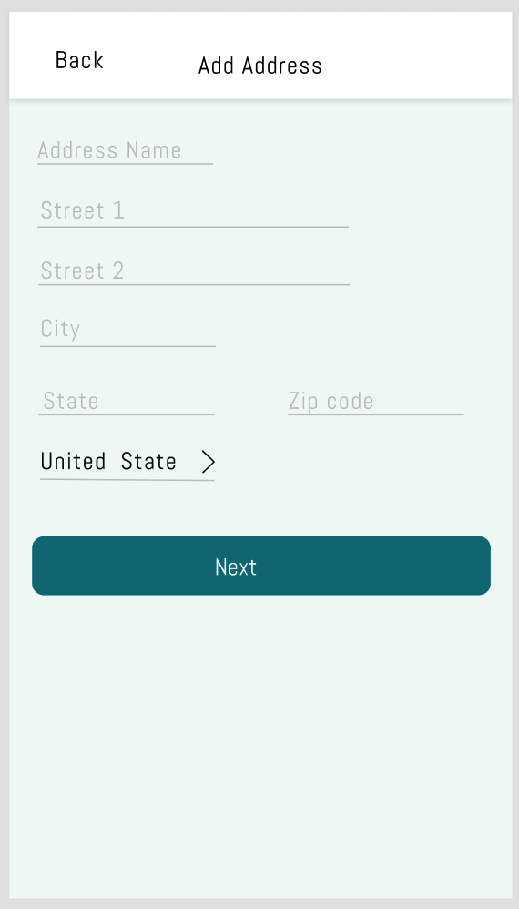
Location: Address
Problem: generate Inaccurate location
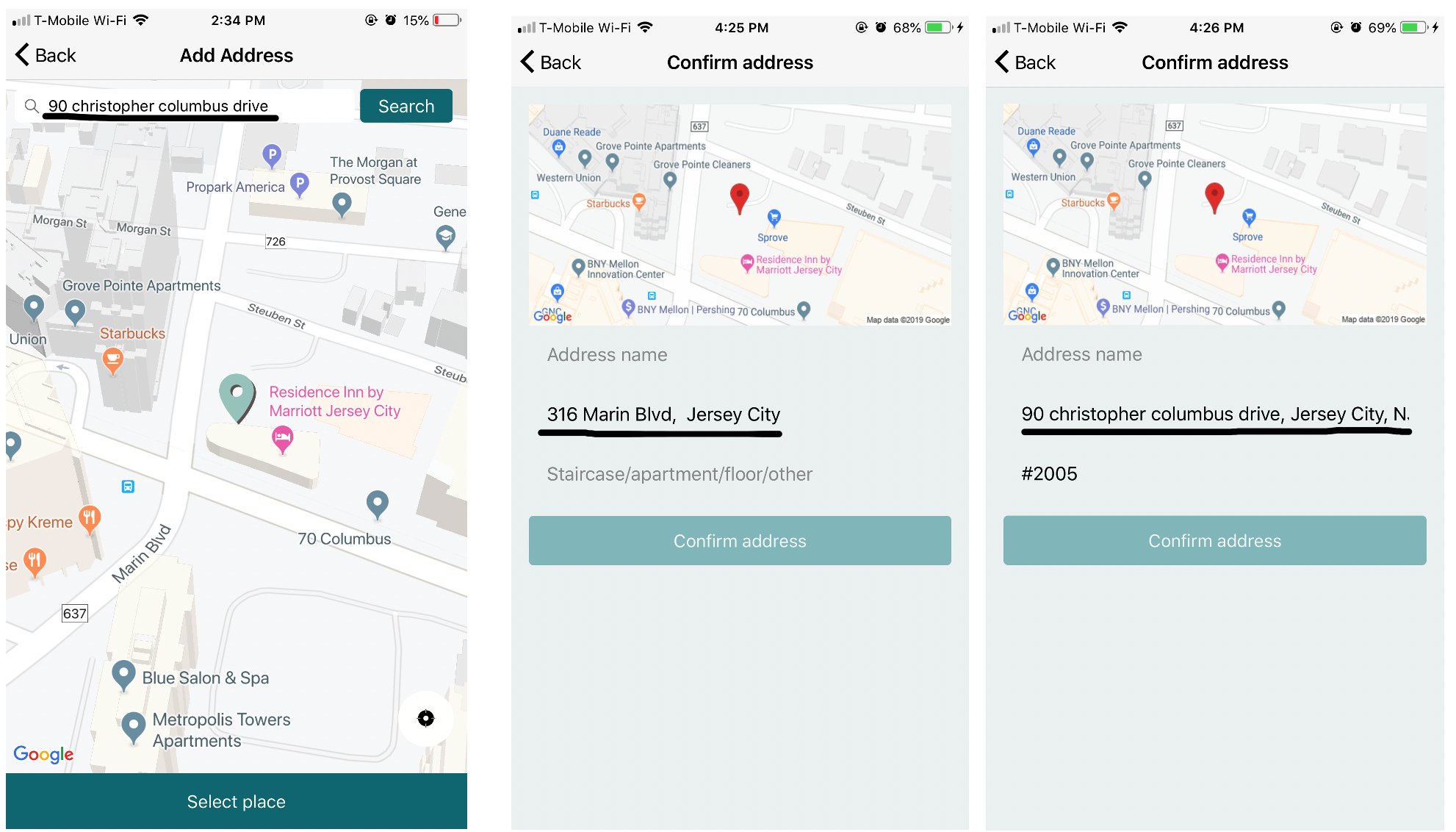
User typed the address and search, then the location flag moved around and finally locate in somewhere. When user pressed the button “Select Place”, the address showed in the address name was not where user typed in. Then the user still has to edit the address manually.
In addition, an interview didn’t recognize “address name” is a blank that needs to be filled and didn’t understand address name used for. So the address name was empty, and “confirm address” button wasn’t validated, user didn’t finish this step and went back.
2. User control and Freedom, Visibility of System status
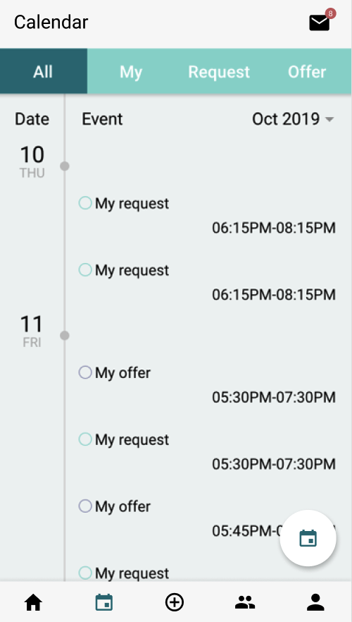
Location: Calendar - Create a babysitter request
Problem:
User can not edit existing request or offer
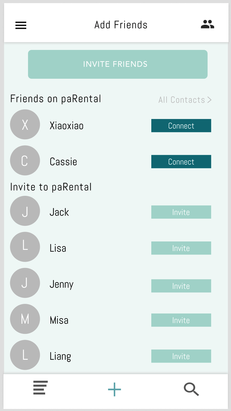
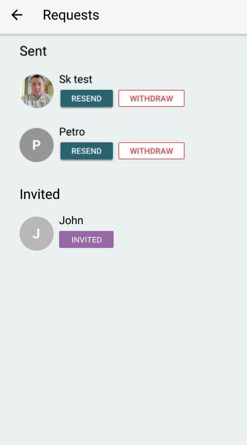
There was no confirmations or feedback after user created a request or sent out a friend request. (Such as connecting a friend, or cancel a request/offer, confirmations function is like getting the receipt or double making sure that you did something, which avoids unintended behaviors)
3. Ambiguity
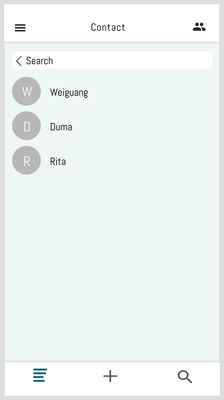
Location: contact
Problem: Navigating ambiguity
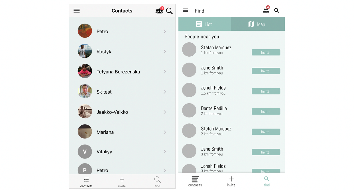
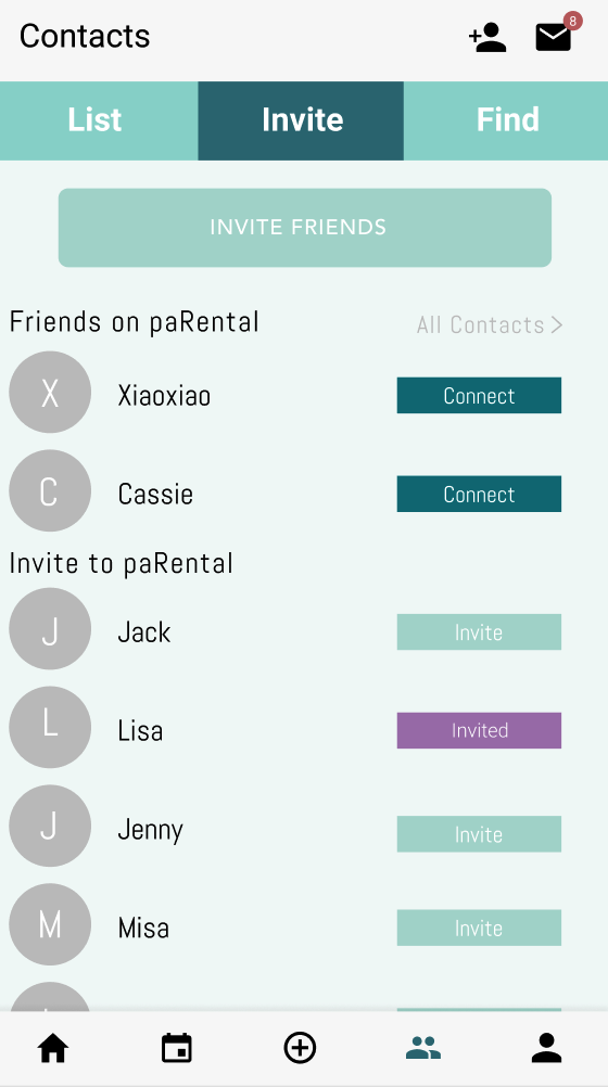
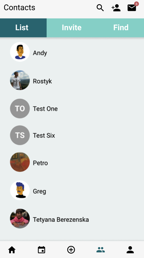
Change (magnifying glass) icon’s position to avoid ambiguity of magnifying glass function in the contacts section and find section.
Contacts find
4. Consistency and standards
If possible, we should keep the consistency to make users get familiar the icons and buttons they will use it later.
5. Recognition rather than recall
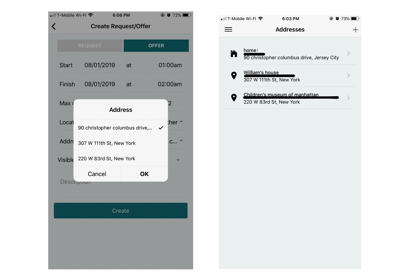
The reason we created different names for different address is to make users easier to choose location when they make a babysitter request instead of retyping or memorizing exactly address. In the future, there will be more address options, to avoid too much recall for users, it’s good to add address names in the option bar as a little reminder.
6. Interview Feedback
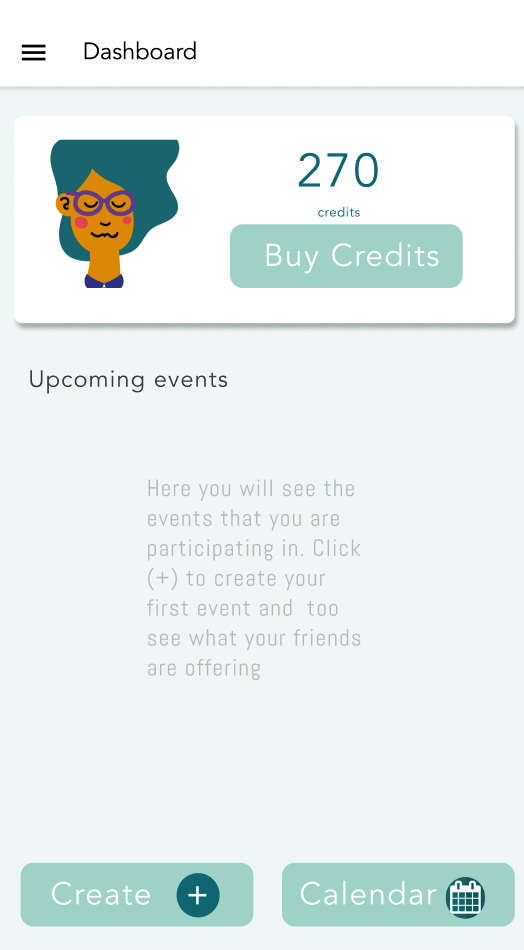
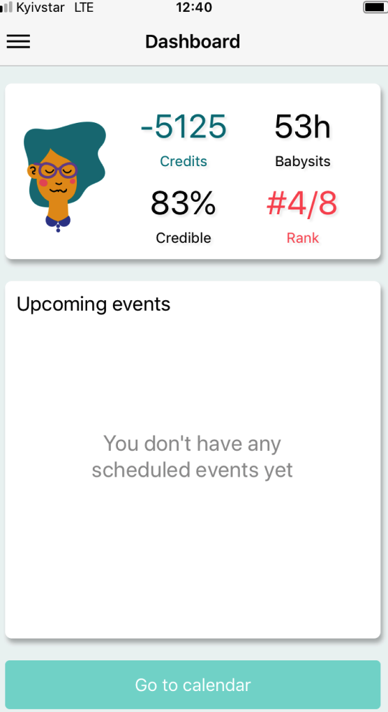
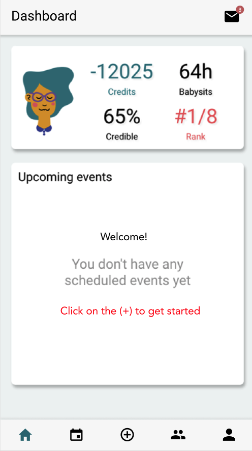
6/1 Dashboard:
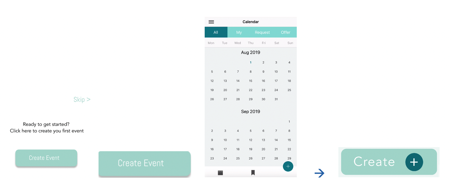
Make creating request/offer more obvious.
Instead of putting the “go-to calendar” in the dashboard, we can make it clearer. Most of the time we are on the dashboard, and people using his app is about checking events (calendar) or creating events (quick create button). Users can either go to the calendar checking out all the events or creating a request/offer right away on the main page.
6/2 Fewer clicks:
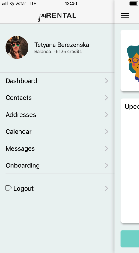
Hamburger Bar makes people click more going back and forth, and most interviewees complained about it.
6/3 Privacy information:
Asking for user’s birth date (year, month, day)
It is a little bit too much; we can set the age range if we want to collect users’ age. Kids’ birth date as well.
Providing potential solution
Dashboard
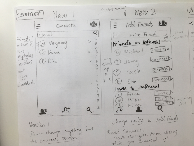
Contacts
Add friends
Add Address

